Megaplan’s mobile application
A mobile application for a leading SaaS service in Russia.
My role: designer
Art-director: Dima Plotnikov
When: 2015–2016
To ensure quality and release functions immediately on the web and mobile, it is only necessary to develop within the company. But there were no mobile developers in Megaplan. Therefore, we chose the known technologies — Javascript, HTML, and CSS. We used the Phonegap/Cordova platform and Framework7 to build this app.
The mobile app is suitable for reading and simple input operations: viewing notifications, reading, and writing comments. It does not entirely replace the web version. Therefore, we discarded complex functions: filtering settings, importing CRM, etc. We also postpone rarely used functions until future releases: creating and editing projects, and editing employees.
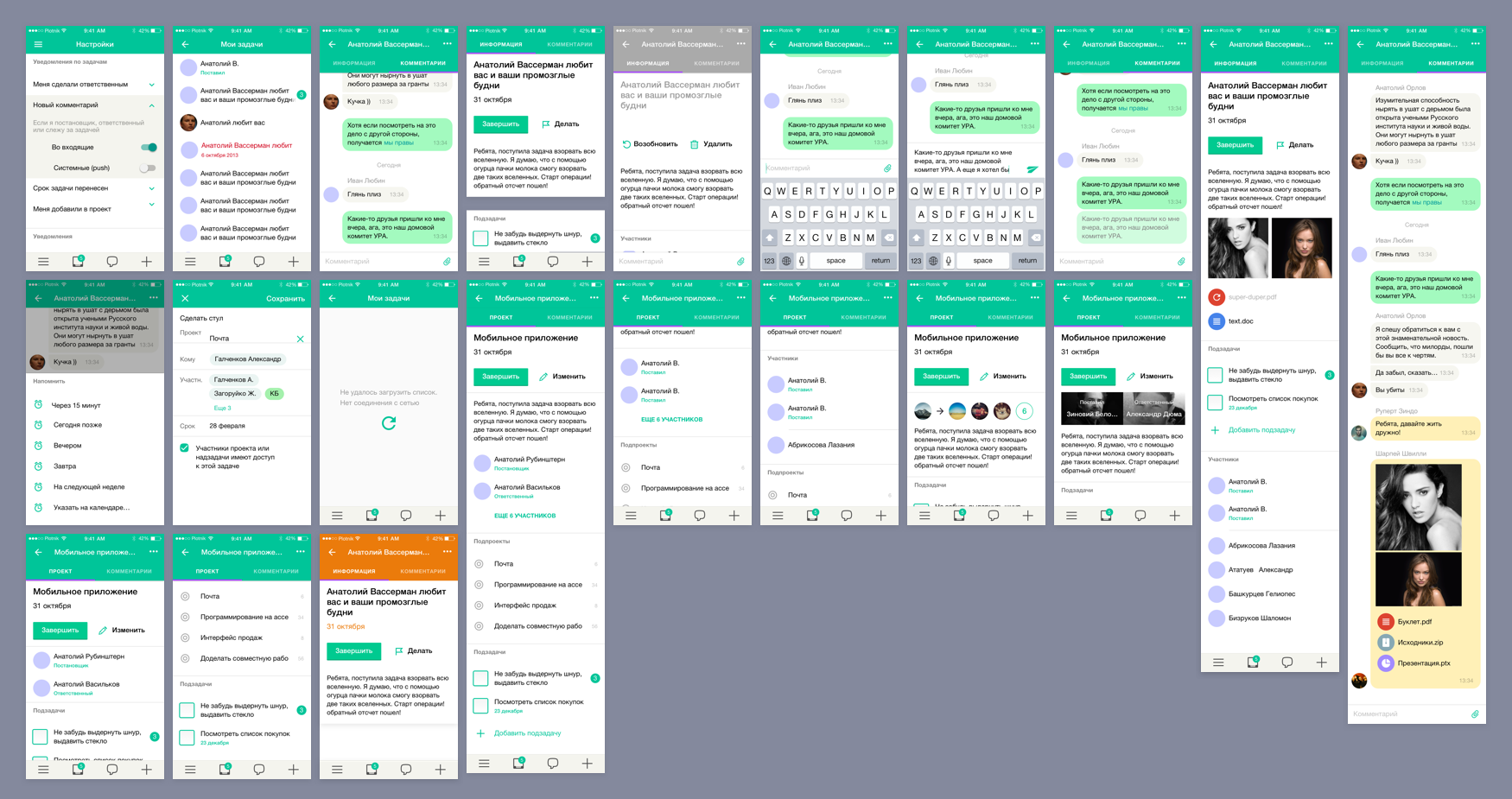
Main scenarios and navigation
Four main scenarios for mobile:
- Viewing inbox — view notifications and comments on tasks, and discussions, and reply to them.
- Creating a task — is vital for managers.
- Writing a message — write to a colleague or create a group discussion.
- Make a call — a standard phone call from Megaplan.
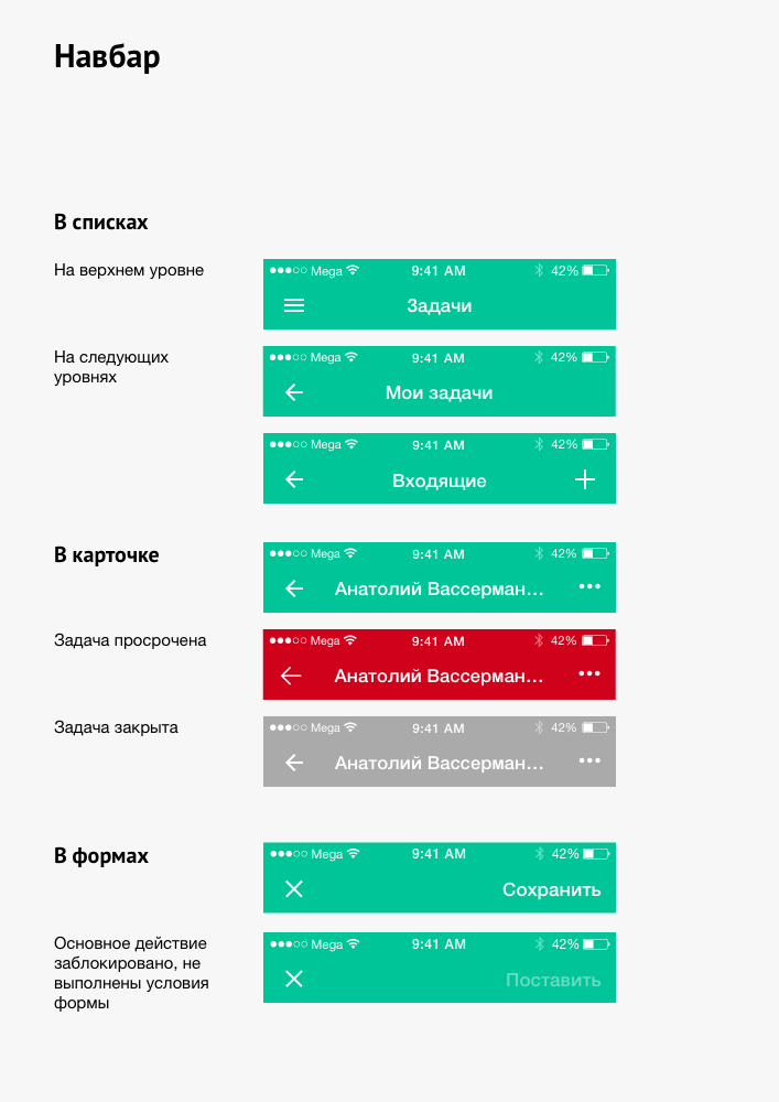
We implemented these scenarios in the toolbar. Global toolbar — shows the presence of notifications in the inbox, and allows you to write, create a task, and open the main menu.
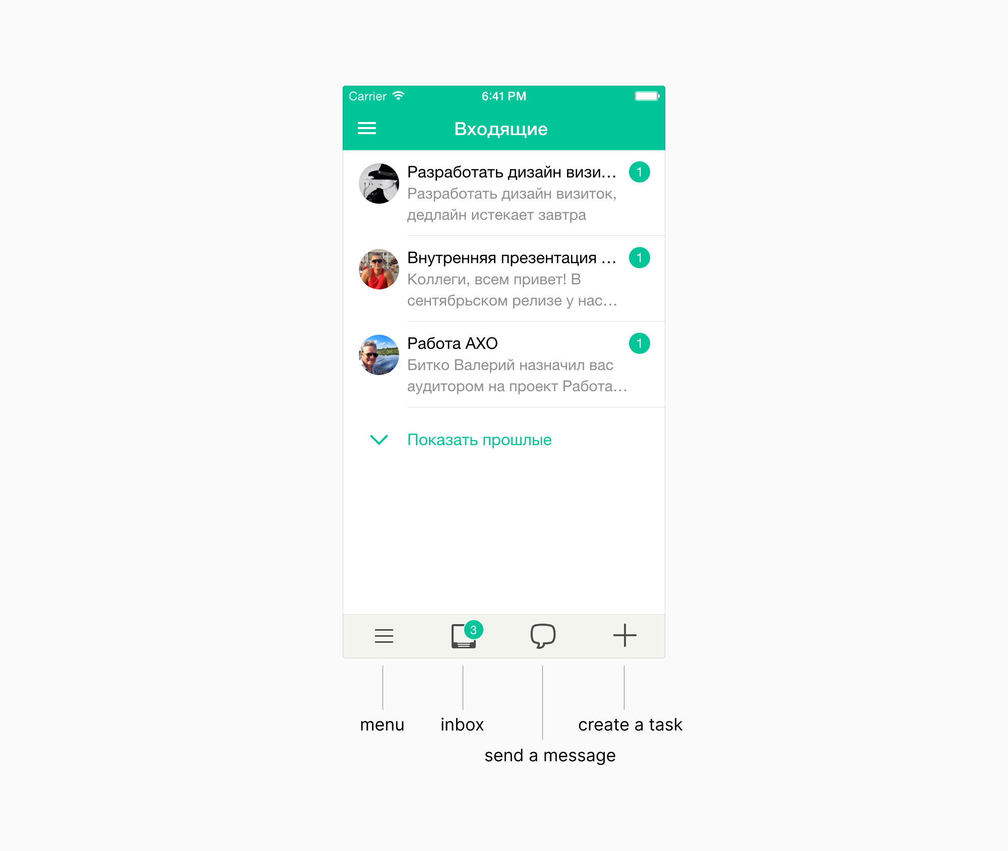
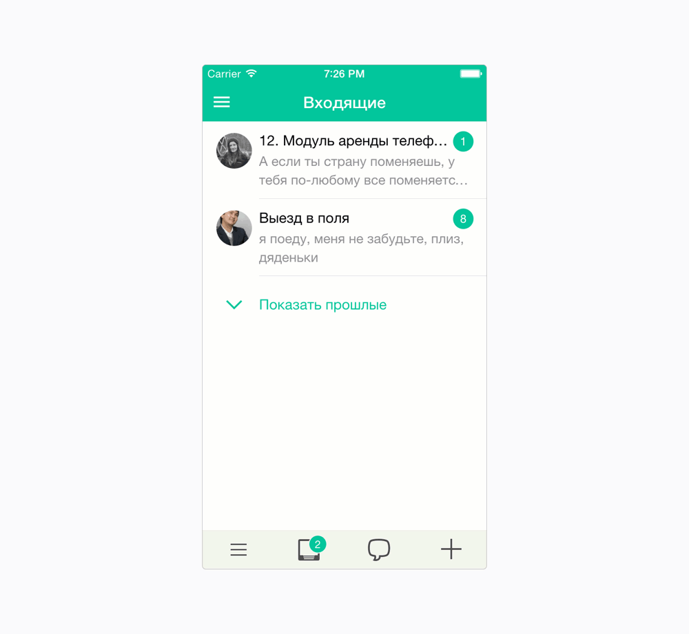
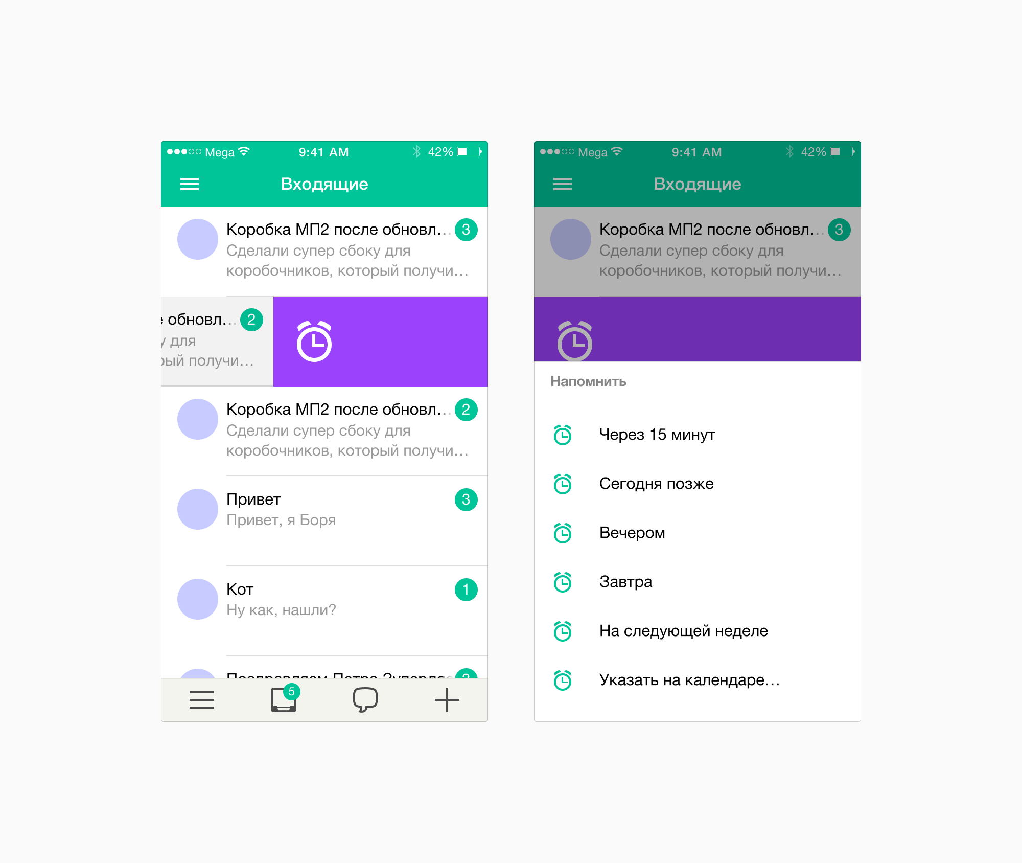
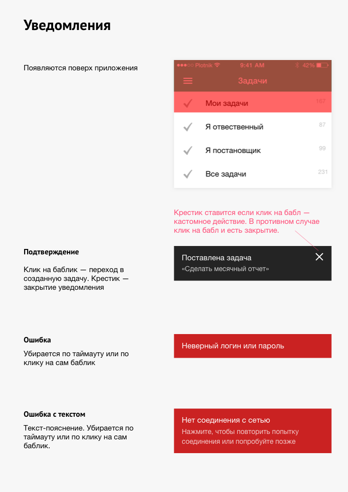
Inbox
Megaplan has an inbox for viewing notifications from tasks, group discussions, and messages. There are gestures, like in email apps: «Mark as read» and «Remind me later».
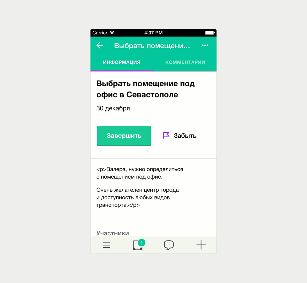
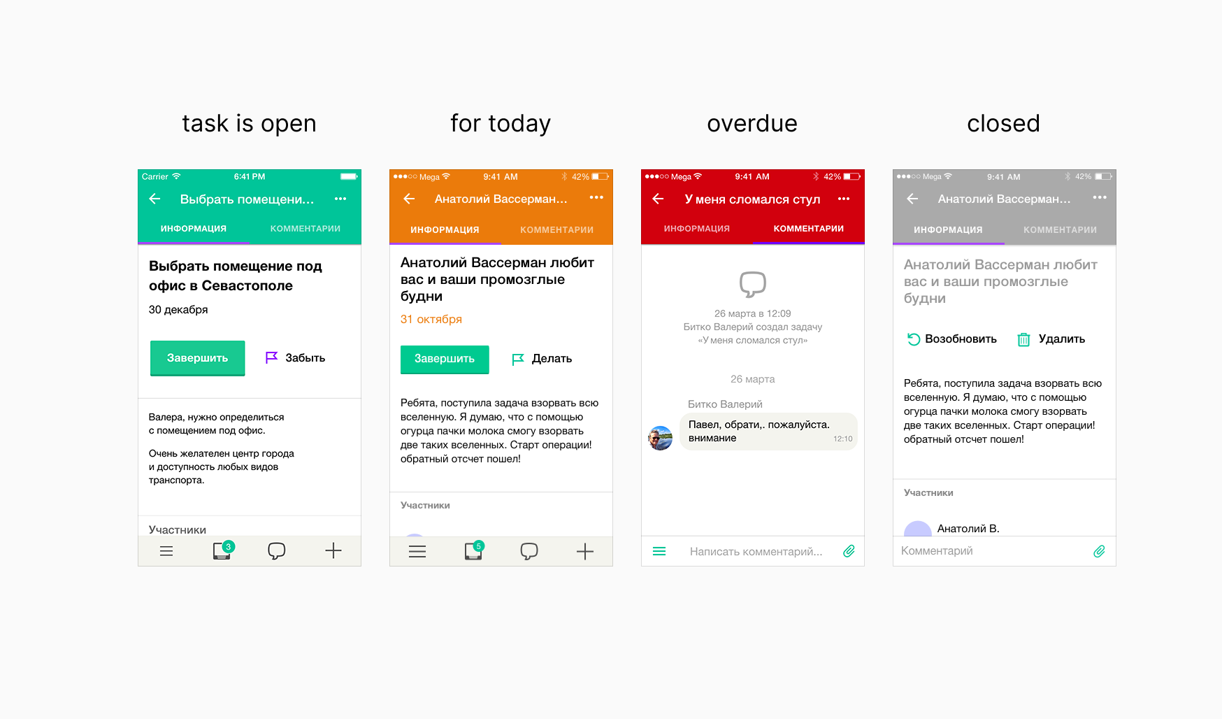
Task Card
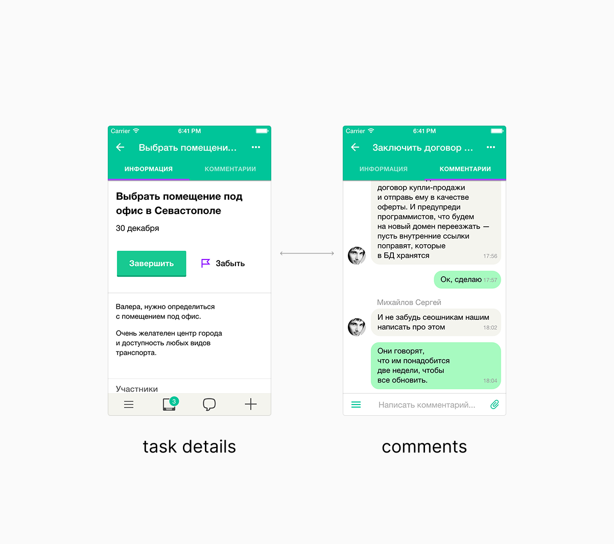
In the mobile application, the item’s card is also the central object. In the task card, in addition to the comments, there is other useful information: description, subtasks, actions on the task, and participants.
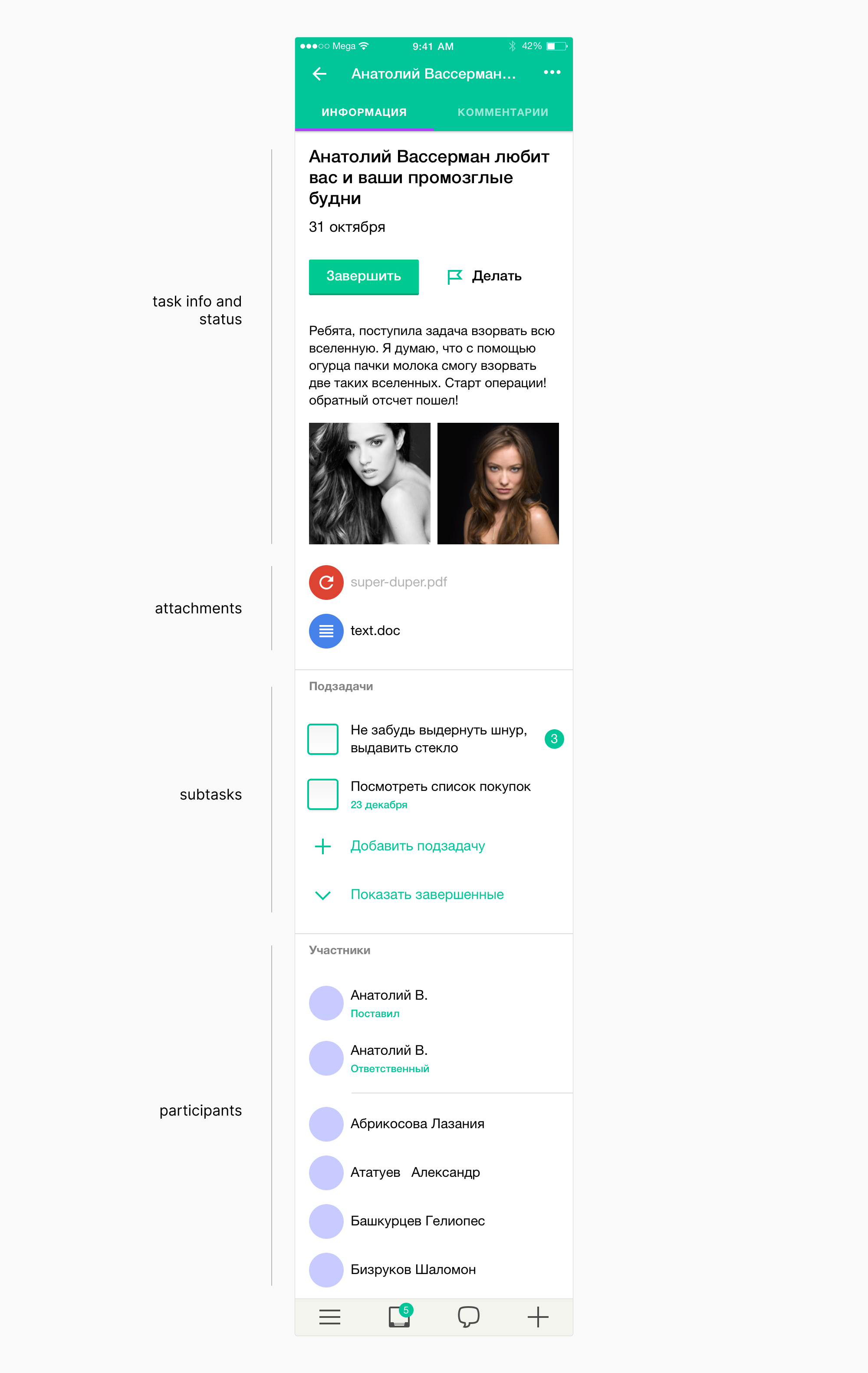
Phone screen size limits layout. Comments can be endless. But showing the rest of the information is a necessity.
The solution is to make tabs that are easy to switch with swipe gestures. We used separate gestures for switching tabs and for navigating back. To go back — swipe from the left border of the screen, to change the tab — swipe closer to the middle of the screen. We make the instructions about gestures for users.
Contextual transition to the card
We created tabs for the card. But sometimes comments are needed, and sometimes task information and subtasks.
We decided to make a transition contextual. If the task has unread comments, we show comments. Otherwise, we show the task’s description and subtasks. So when the user enters a task from the tasks tree, the app shows task details first. When viewing cards from the inbox, the user gets the new comments.
Creating a task
The minimal scenario is to click the plus icon, enter the name of the task, and click «Create». The assignee is the task creator by default.
Full scenario — specify the project, client, and attach files:
Same form is used for creating subtasks and for editing a task.
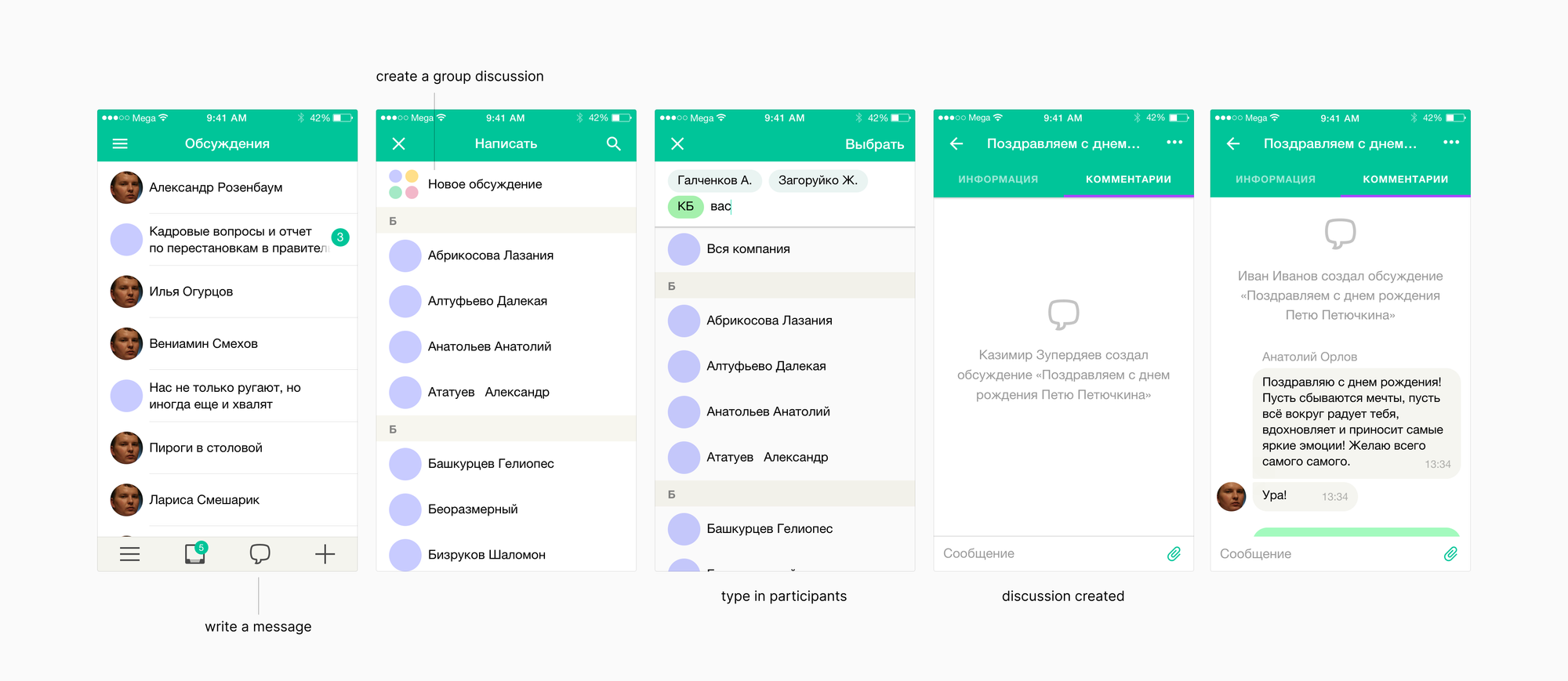
Writing a message
The first thought was to make writing a message as creating a task. But users often write messages to one person. In order not to ruin this scenario, we minimized the number of actions. The message dialog immediately shows the list of employees and the search. Click on an employee — go to personal chat.
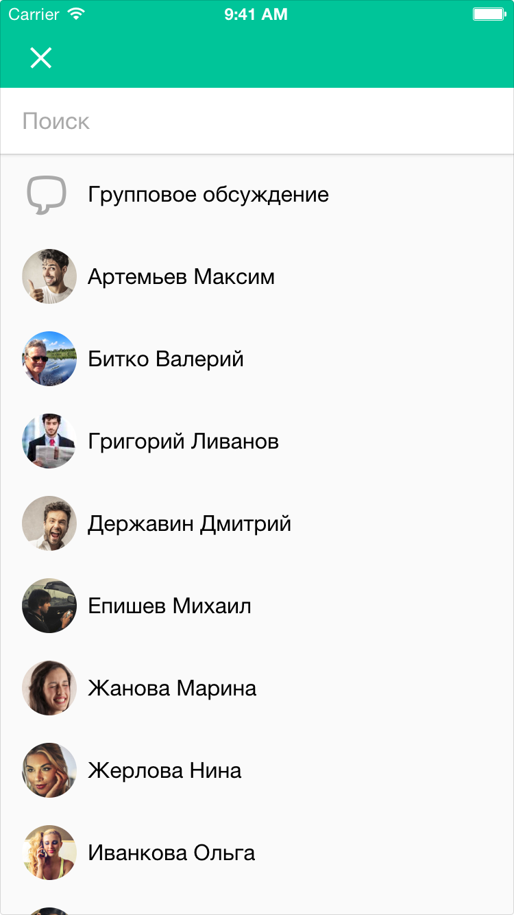
For a group discussion, a user presses the first item. Then, select the participants and enter the title of the discussion.
Guidelines
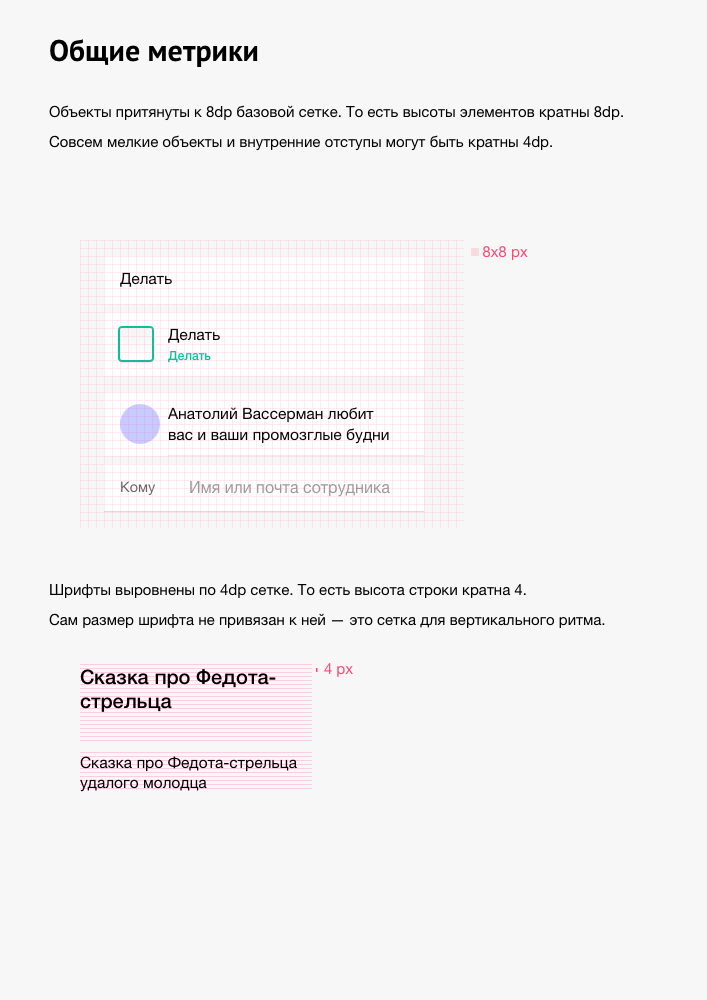
The guideline inherits Google Material Design but adapted for a cross-platform application. The minimum clickable area is slightly wider than in iOS — 48dp.
Controls are taken from Framework7. But we redesigned the participant selector.
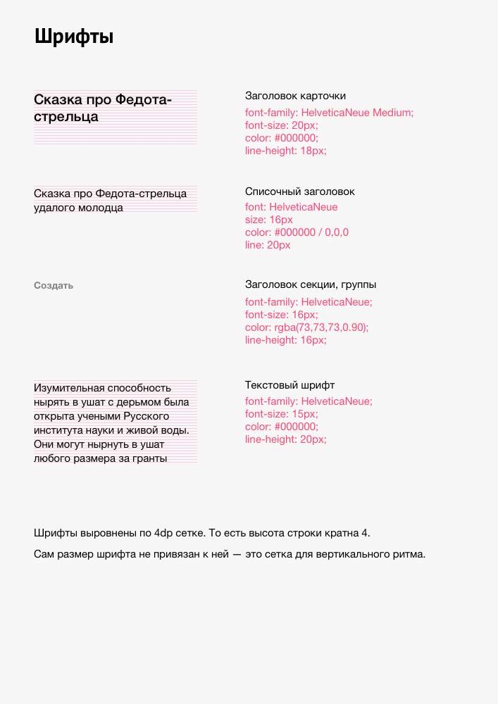
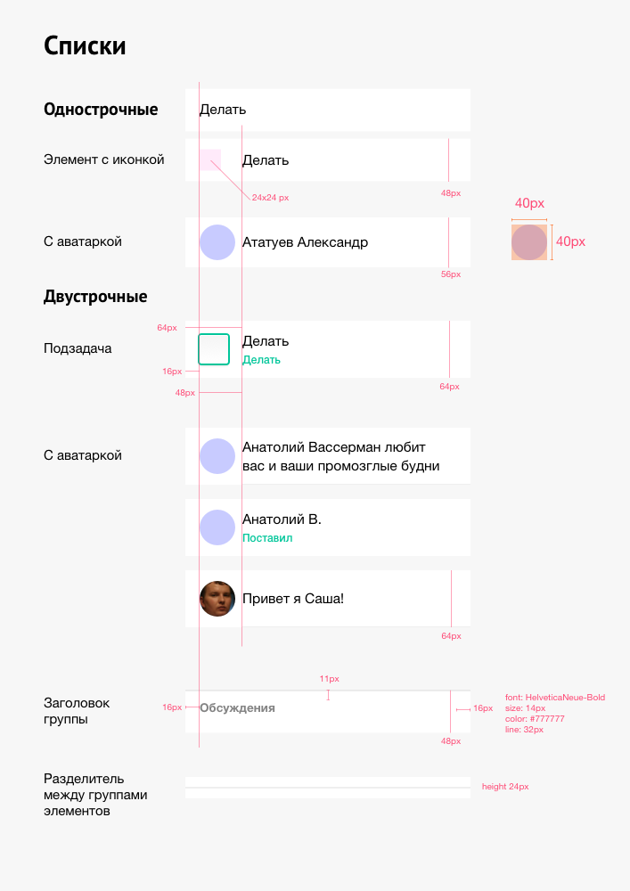
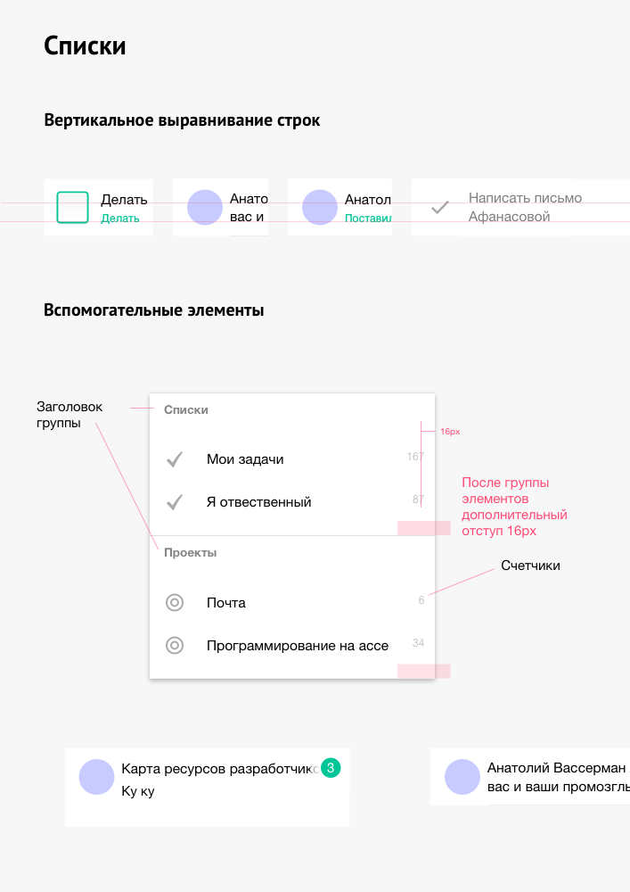
UI guidelines
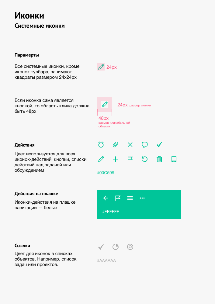
Color coding
In Megaplan, we use color coding for the deadline of tasks. Orange — deadline expires today, red — overdue task. We applied this encoding to the color of the navbar. Green is an open task. Orange is a deadline today, and red is an overdue task, gray is a closed task.
Iconography
I drew the icons on the grid from Material Design. The icons for the actions are green, and the decorative icons in the lists are gray.
What I learned
It is my first mobile application, which consists of more than a couple of screens. Since this is an app for an existing product, no difficulties arose. The restrictions imposed by the mobile device only simplify the design of the screens. One column — there is nothing to be done — you put blocks in a sequence. Clear guidelines for mobile platforms helped.
Switched to sketch
First experience with Sketch. After two weeks of getting used to it and loved it. There were 3 or 4 approaches when I had to edit and redraw all screens. Sketch saved a lot of time because of styles and symbols for reuse. Drawing so many screens in Photoshop is excruciating. Yes, there are also styles and smart objects, but Sketch allows you to do this twice as fast.
Once I moved from Photoshop to Fireworks, then back to Photoshop. Photoshop is useful when you draw a couple of layouts. It versatile — it works with raster and vector. It has everything that a designer needs for drawing and editing images.
The Sketch, despite periodic crashes and glitches, beats Photoshop in drawing applications.