Zettaplan
Megaplan — is a service for collaboration on tasks and projects, and sales management. Work on the new Megaplan application.
Timeframe: 2013–2014
My role: Designer
Art director: Dima Plotnikov
Megaplan — leading SaaS on the Russian-speaking market that combines project management, task management, CRM, and Sales for small and medium enterprises.
I worked at the company for half a year and did a redesign of CRM when new Megaplan's task management app started (renamed to Zettaplan).
After I finished work on CRM, I joined the Zettaplan team. At that time, the team had already implemented the tasks management, list of employees, documents, inbox, and calendar. It was a working prototype. We used it as our tool internally. And that helped us to rethink tasks and project management tools.
Also, there is an article by Dima Plotnikov on the redesign of Megaplan.
Why a new product
- It was difficult to make changes within the old interface. With the addition of features, the product loses its flexibility — «This function cannot be simply changed, removed, client X uses it.»
- Old client architecture — when you go through pages and lists, everything reloads synchronously. This limits the liveness of the application.
- The consequence of the previous paragraph is that it takes a long time to process incoming or customer lists for dialing. It is much faster when the list of entities is on the side and does not overload along with the entire page.
- It had too many functions, rules, and settings. Executives wanted a product that was easier to use at the start. So that the user can adopt it during a trial period.
Tasks
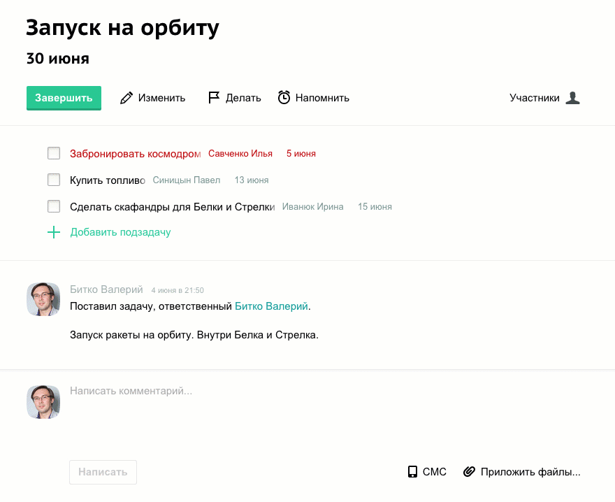
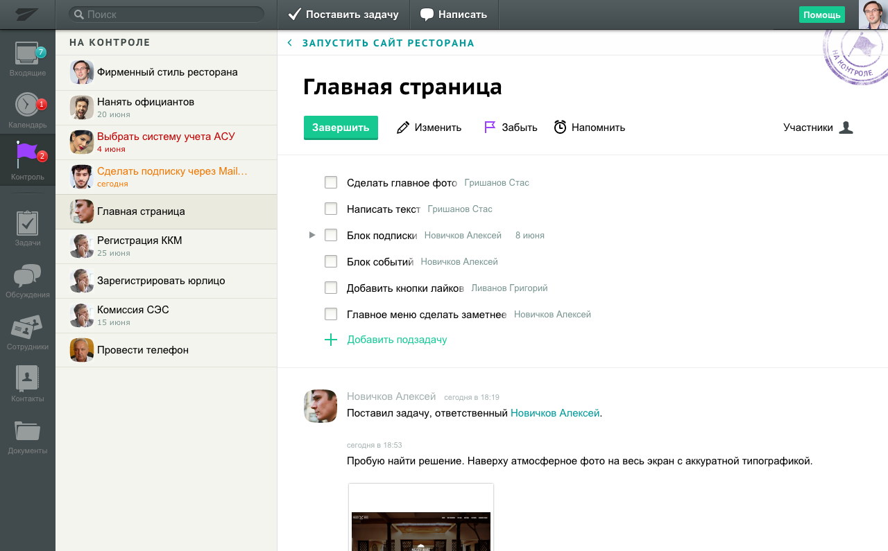
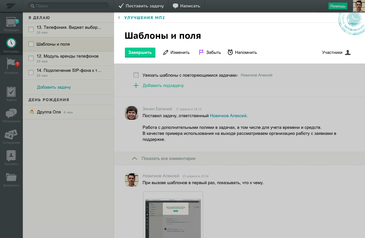
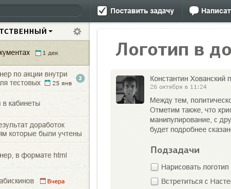
Tasks are the primary tool of Zettaplan. Meetings and errands are also tasks. In Zettaplan, I learned to put maximum effort into things that used 90% of the time. Therefore, I made a lot of effort in designing tasks — I redesigned the task’s page severely at least three times.
We examined scenarios of work by frequency of use: comments, adding participants, delegation of tasks, working with subtasks, and editing.
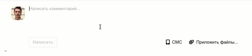
Then, we tried to maximize the experience of most used features. We tried a floating comment line to start writing without scrolling down the page. But it turned out ugly, and there were already too many floating elements. We did a quick transition to the comment form by a clicking semi-transparent strip nailed to the bottom of the window.
We tried to put the participants list under the comments section. One evening I drew 20 variations for the task's header — I achieved clarity.
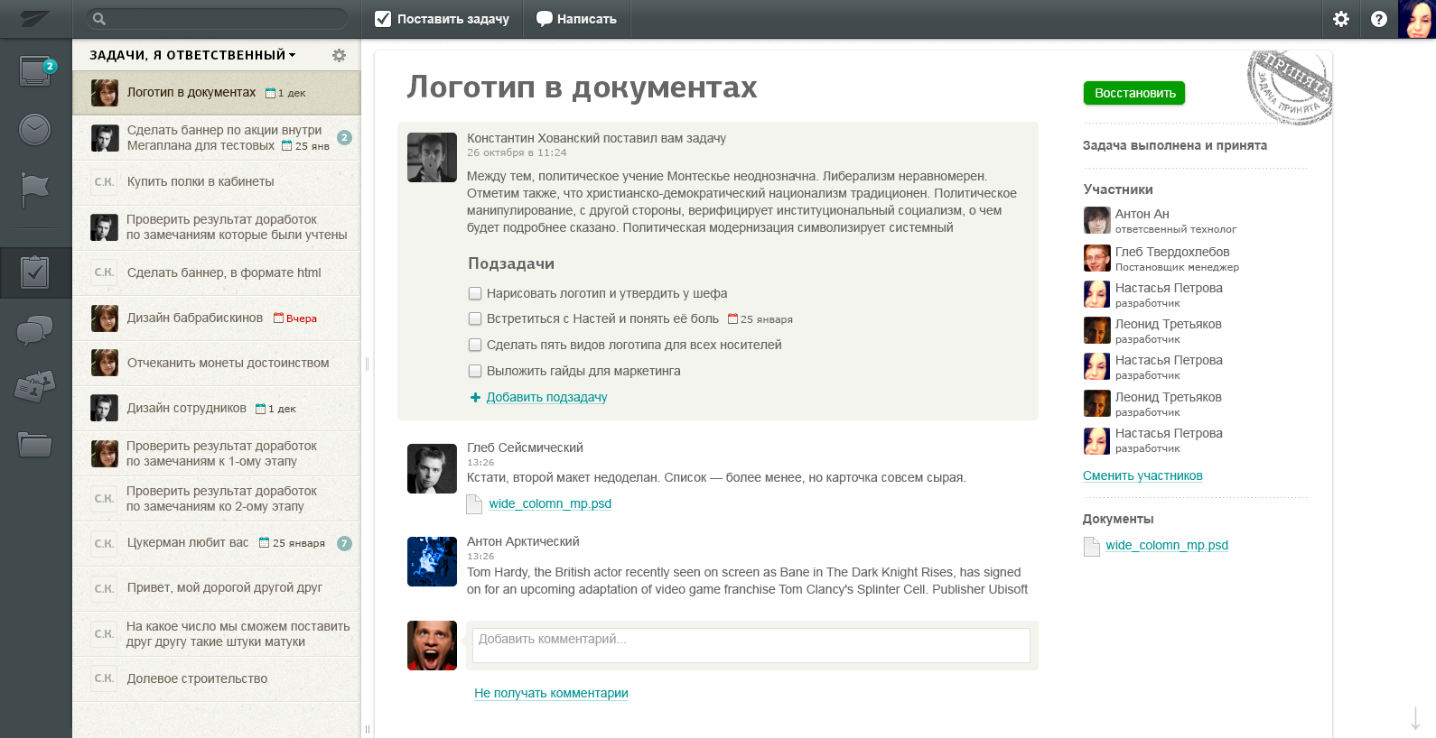
As a result, the task page turned out to be clean. More than 90% of the time, people write and read comments, attach files. So we made it straightforward.
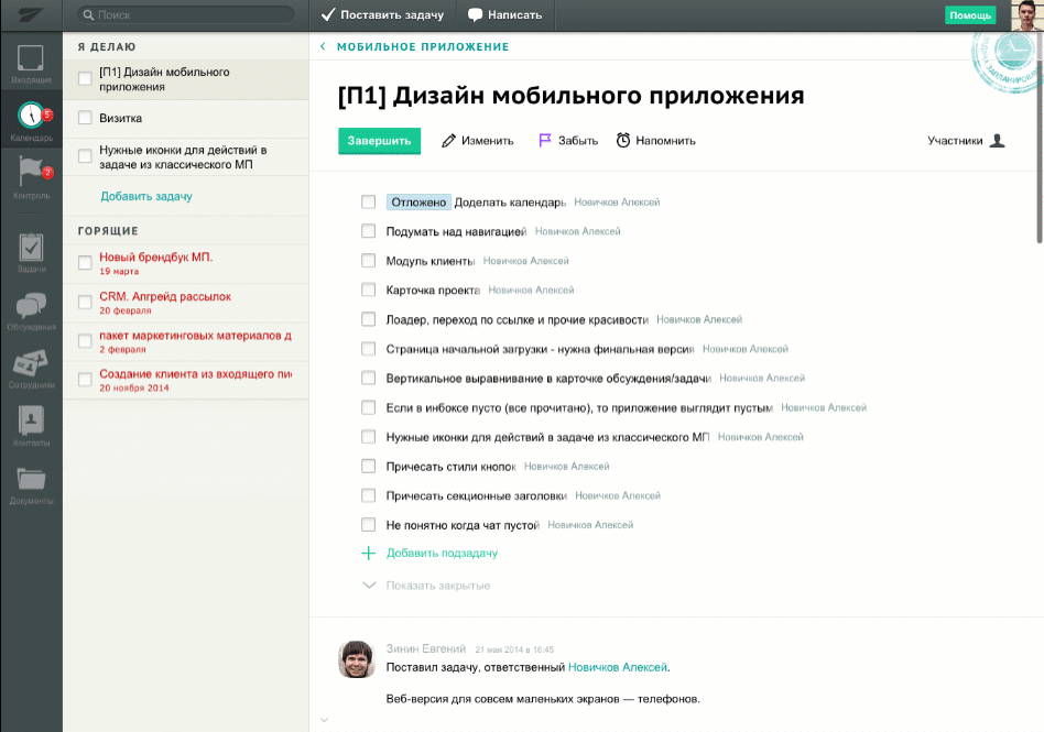
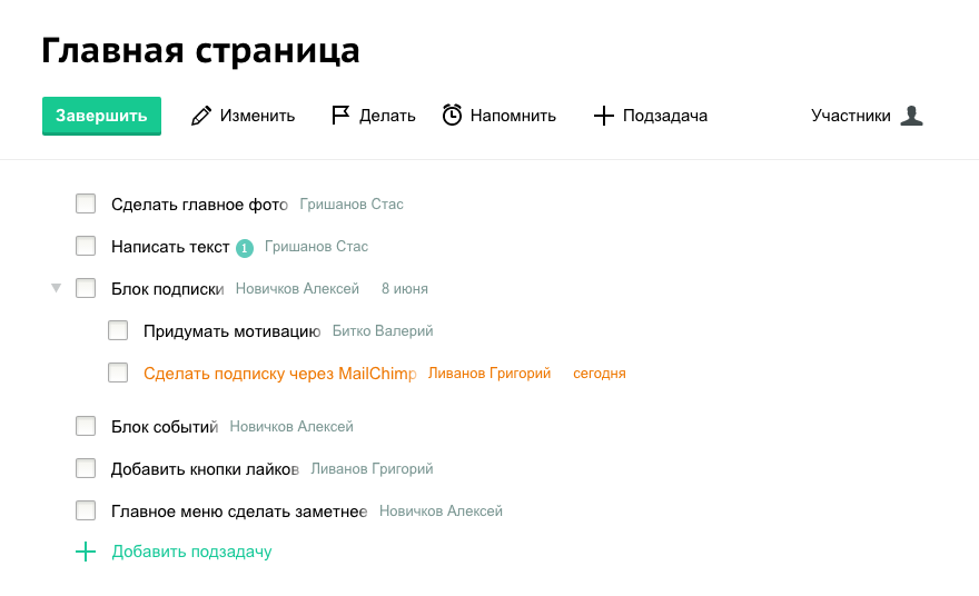
Subtasks
In real life, it happens more than one person does a task. In the classic Megaplan, there was a «executor» role for that. But this entity does not give an understanding of who is doing what. And subtasks show who does what. So we encourage people to commit their work as tasks.
Sometimes part of the work is delegated to subordinates. The subtask solution is scalable. A task of any level can be divided into subtasks. Therefore, the nesting of tasks in the Zettaplan is infinite.
Quick adding of subtasks with deadlines and responsible
The block of subtasks is the first on the task’s page. In a task’s life cycle, they are used more often than a description, which does not change frequently. We also added a quick jump to subtasks by clicking on the floating header:
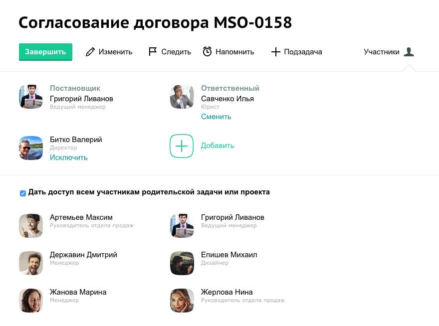
Participants
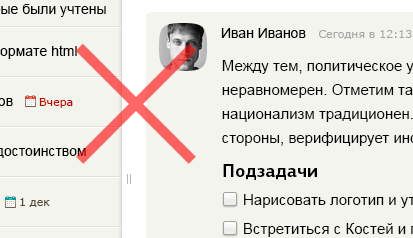
Participants were first displayed in the right column. I removed the right column. Because the page was heavy, and it was not suitable for the iPad. The linear structure is perceived easier. You may only need participants when adding a colleague to a task. They are also visible in the comments. Therefore, we hid the participants behind the button. It allowed us to show participants nicely and clearly.
Mentions
Write to a person in a task without additional invitation:
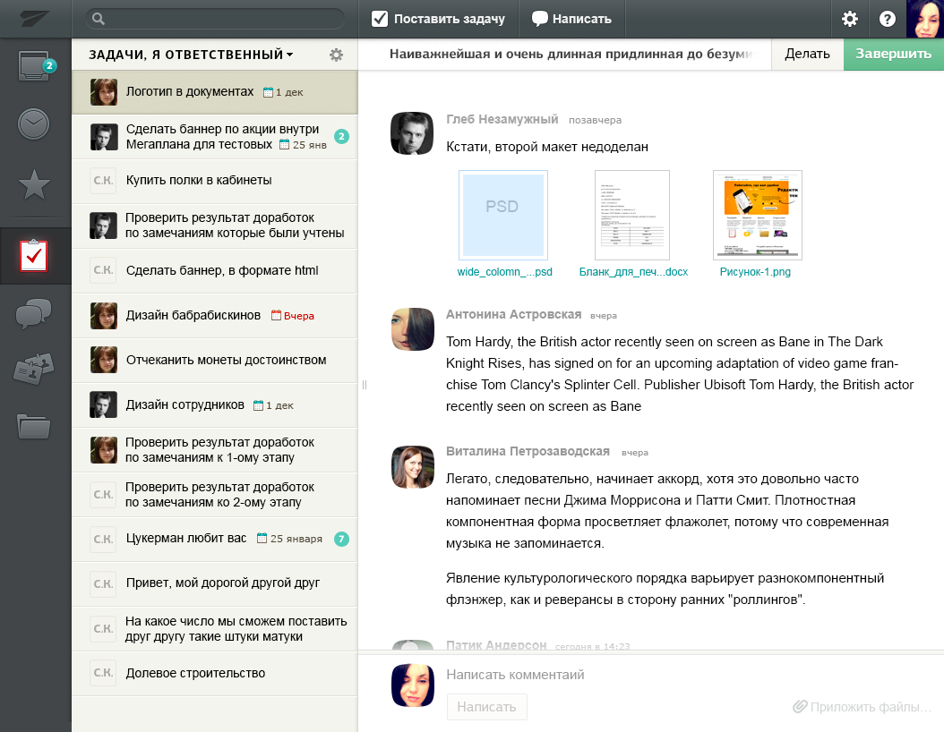
File attachment
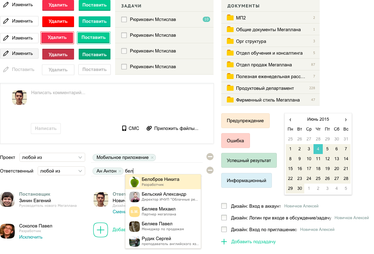
According to Fitts’s law, the whole window made as a target for dropping files. The target is the current context: opened folder, task, task form. If the user entered the folder at the third-level of depth — it is the current context. To drop a file into a second-level folder, you must first select it. This is a useful limitation. A rule that works equally throughout the system and makes the interface predictable.
Paste an image from the clipboard, drag and drop, or attach it through the native selector
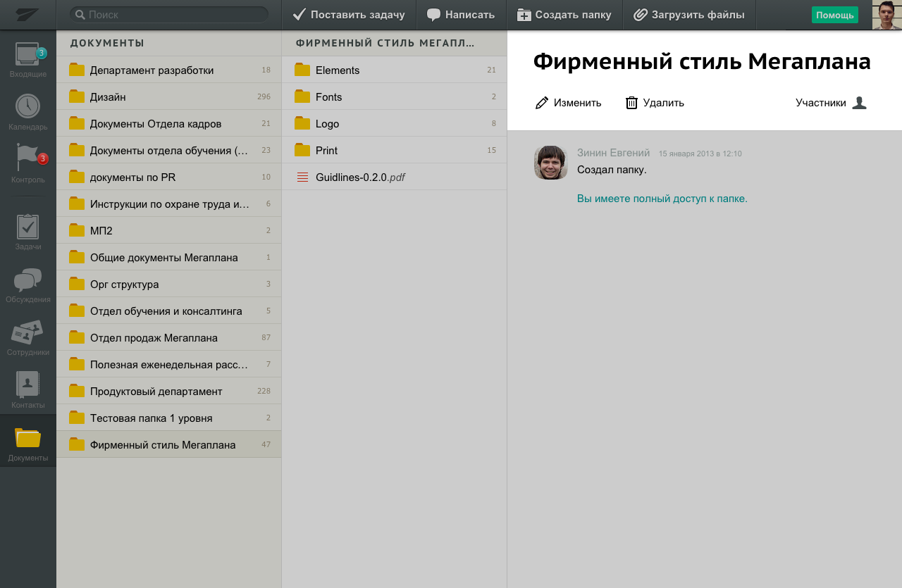
Organizational structure
The structure of the company is the first thing i did when i joined the team. I used an existed component to solve the problem. Documents in Zettaplan is a column-based interface — each level opens to the right. Suitable for navigating hierarchies such as company organizational structure.
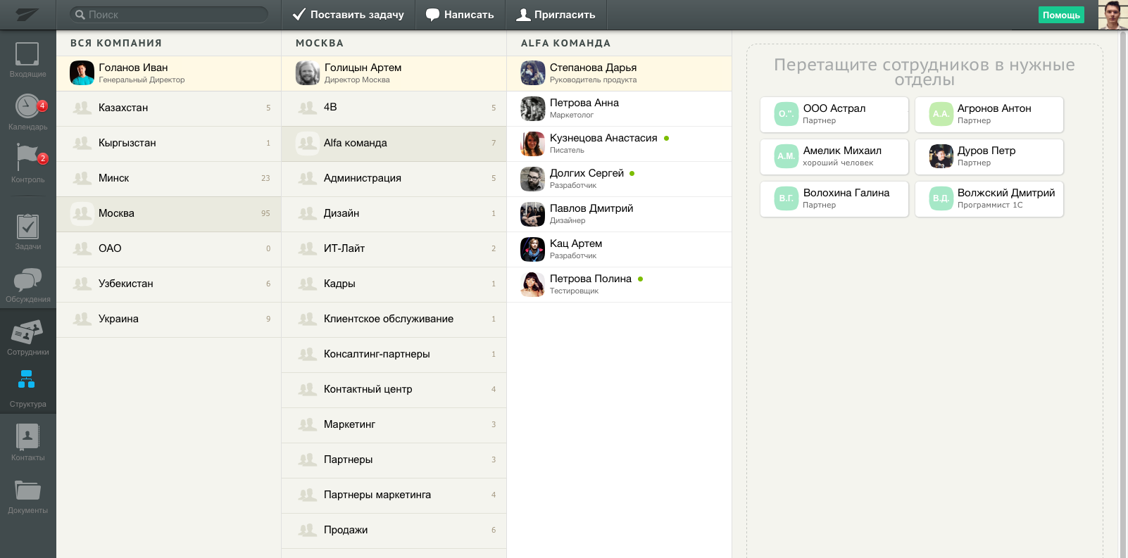
Departments and divisions are folders. Undistributed employees are visible on the right after all columns. It is convenient to drag employees from the undistributed list to the selected department, no matter how deep it is.
You can add whole departments to tasks and discussions as participants:
Participants and access rights
The tasks and discussions often include commercial information. A scalable solution is needed where access depends on the position of the employee.
In Zettaplan, the system of access rights is based on the structure of the company. Sometimes there are parallel structures in companies, so superiors and subordinates can be specified individually.
In the previous version of application there is overabundance of roles. A few colleagues were able to recall the differences between the roles, and the clients were also confused.
Therefore, we reduced the roles to this:
- Directors have access to everything
- Managers see everything from their subordinates
- Employees see everything where they are participate
Inheritance of credentials
Scenarios:
- A client participates in the project — the manager does not want to show all the tasks and the inner kitchen
- A subtask discusses financial information that I don’t want to show to all participants in the parent task.
Everything should be simple initially. Therefore, we introduced the inheritance of credentials. Credentials are transferred to all nested tasks. In a task, we show who it.
When privacy is needed, you can disable inheritance, and only direct participants and managers will see the task.
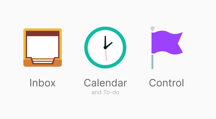
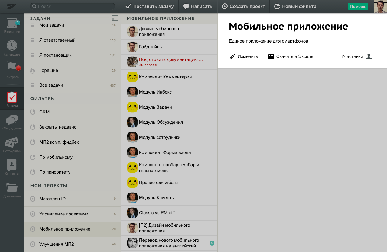
Employee workflow

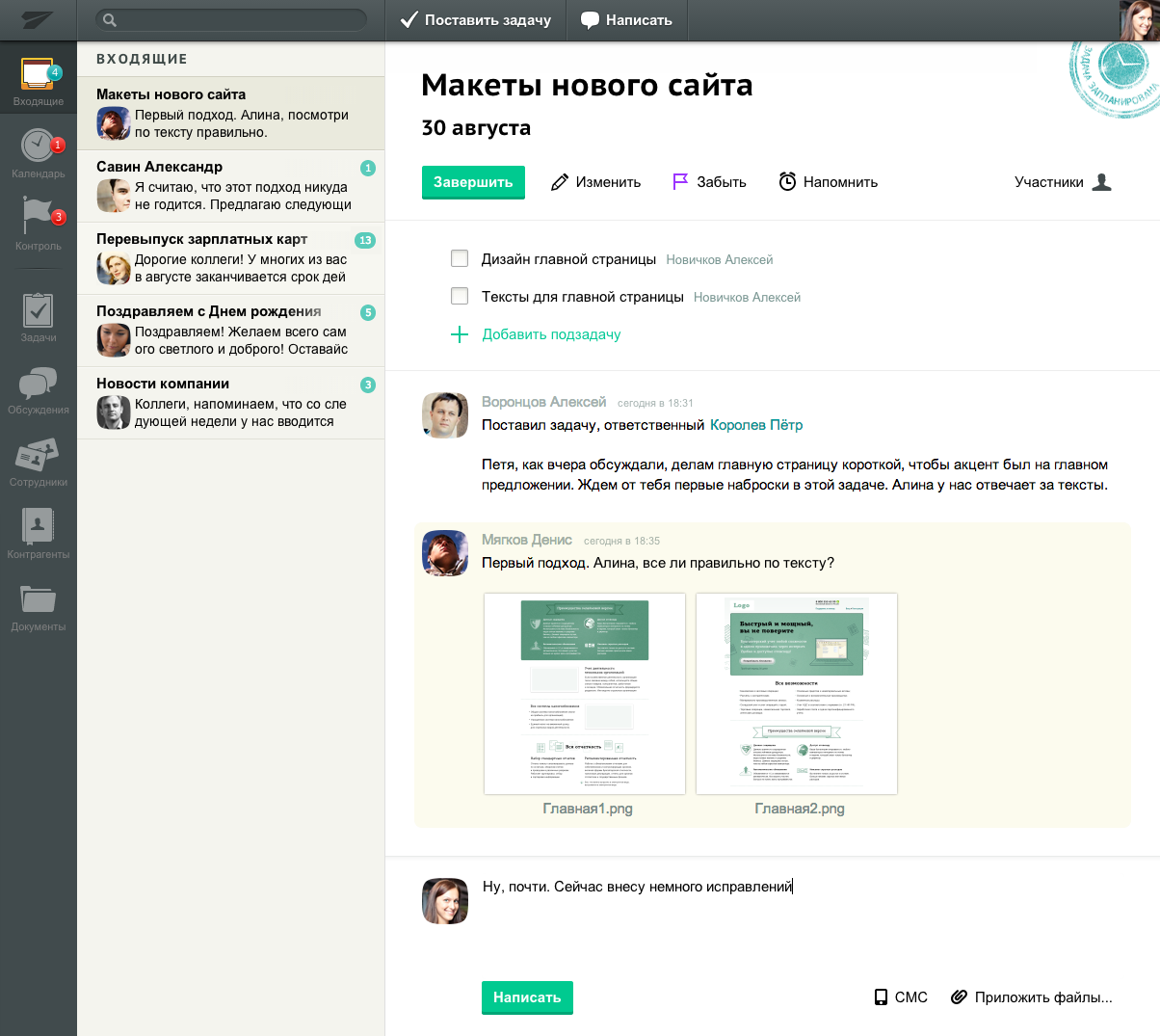
The employee’s regular workflow is to clear inbox, get done their tasks, attend to meetings, and control the tasks they set. To support this workflow, we made three modules: Inbox, To-dos and Control.
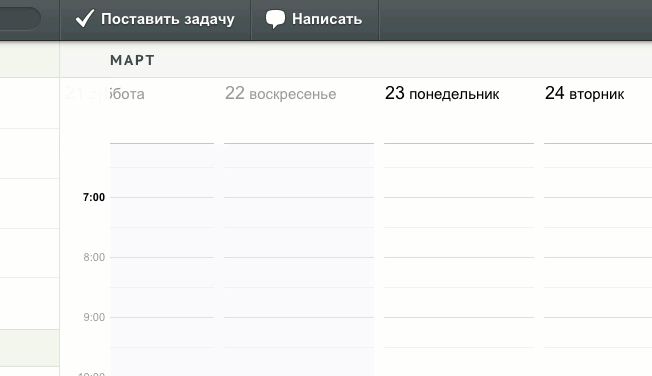
In To-dos, there is a calendar and the «Doing» list of tasks. The employee collects this list of tasks for which he is responsible. There are also expiring tasks and meetings. All the current and upcoming work in one place.
Selection of tasks to the «Doing» list
«Control» — here are discussions and tasks for which you receive notifications. The manager and the assignee of a task always receive notifications, and the rest of the participants — as them choose. The participant puts the task under control by clicking the «Track» button. The manager, although he always receives notifications, also can add tasks to the control list.
Every day, an employee enters these three modules to see the situation, learns new things, and prioritize what to do first.
Components library
A large product consists of bricks. Elements are standardized and universal for reuse.
Developers and designers like to make new controls and features — this is interesting. But it also complicates the product and reduces manageability.
Solving problems with existing components gives good effects: it simplifies product development, lessens cognitive load because it is fewer elements and variations in the UI.
One example of this — is a header of page. It is the same for all Zettaplan entities. Regular title, action buttons, and participants to manage access rights:
The header of any entity adapts to a context but follows the same rules
Interface principles
Focus
Some software products swarm with features. But when you look at their interface, you don’t understand where is the main thing, and what to do.
In Zettaplan, we sought clarity. The page or list which you open — it has a white background, is highlighted, and the parent list fades a little. This is visible when going to the card and in the column interface. It’s clear where to look. It is user attention management.
Focusing the user's attention on the card or a list
Simple layout
All pages have a linear structure for easy reading. The task and discussion consist of one column of blocks. Only different levels of information are parallel in Zettaplan, for example, a list and a card, but they are visually separated.
Buttons with icons and titles
In Zettaplan, we had a rule — the buttons with the icon also have titles. An icon-button without a title is an exceptional situation when it stands alone, and there is no space left for a title:
Visual clarity
As in the information graphics, in the working interface, every detail must be abandoned if it’s unnecessary. When i switched to Zettaplan, i saw noise and extra details in the interface. I began to get rid of them.
The metaphor of the sheet for the card did not attract the necessary attention, and the counter form created visual fragmentation:
Due to the less bright background of the rest of the interface, an open page focuses on itself. A minimum of elements needed.
Counter forms attract unnecessary attention. Therefore, the blocks and dividers we stretch the entire available width of the card:
Icons i made cleaner, get rid of unnecessary details. Straight lines, rounded corners in places, and no complex curves:
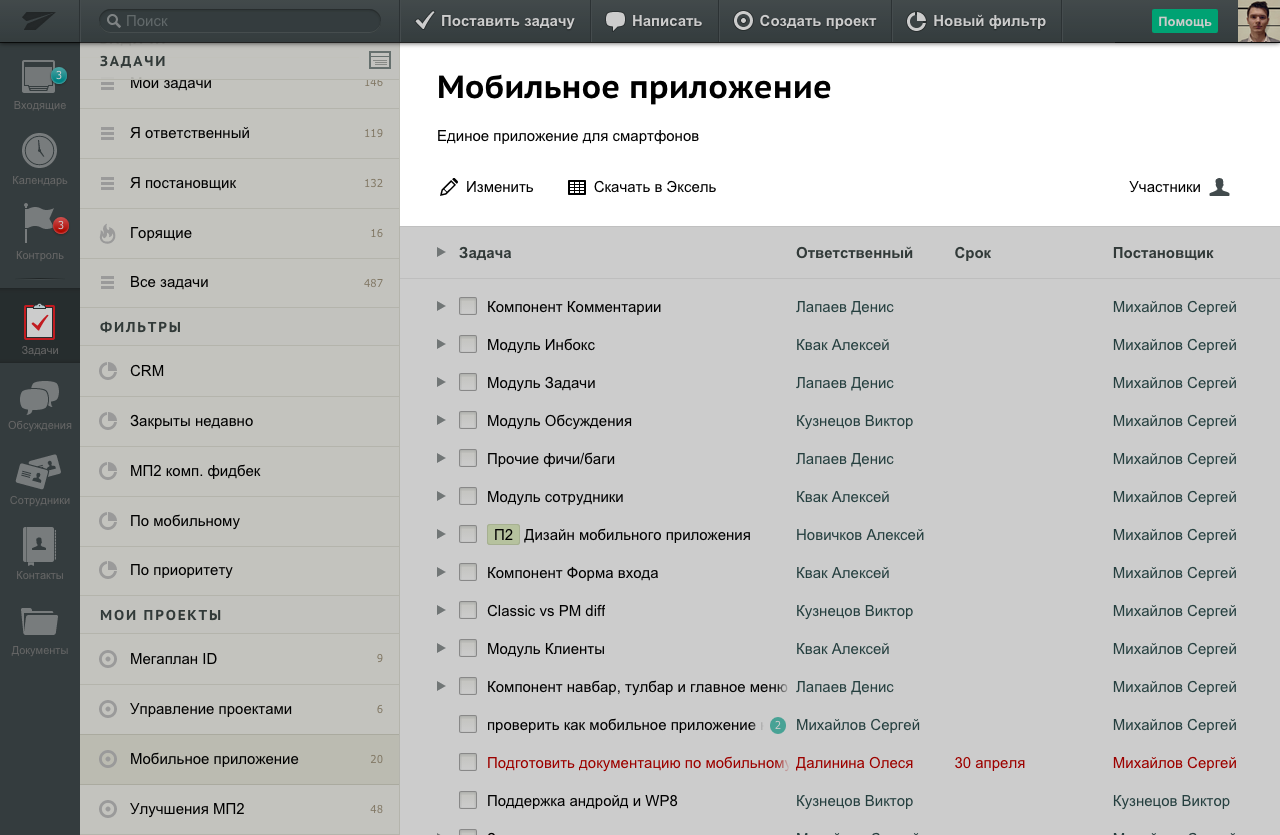
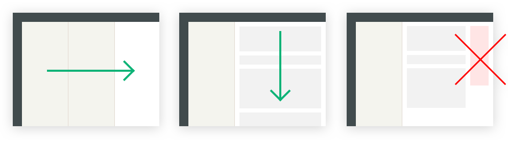
Columns layout problems
UI with the columns layout suites for processing lists, for example, to call a list of clients. But it also has limitations.
Nesting in tasks
Nesting is shown by the «Documents» — due to the sequence of columns, as in Finder on Mac OS. But this is not suitable for task lists. The task card is the main work tool. In tasks, people read and write comments, upload files, add subtasks, and participants. The contents of the task cannot be compressed into a narrow column.
We came up with a compromise. Show filters and projects in the first column. Tasks list of the project in the second. When a user clicks on a task, the first column hides, and the list of tasks remains beside the opened task. So the user can quickly switch tasks:
Tree view
Another drawback of the lists in the column is the low data density and the inability to see the structure. A manager can’t view a project’s tasks with details. For that, we did a tree view:
The subtasks is a simplified tree:
What i learned
Megaplan is the first product company in which i worked. I had little idea and underestimated the complexity of the internal structure. I thought that software for companies was bought at almost no cost to the manufacturer. It is worth making a product and giving advertising — money will flow like a river. It turned out that the B2B-software need sales and training departments. It turned out that employees of many companies are in no hurry to clean up and make processes transparent. Sometimes a business leader simply does not understand how to implement it or does not have time.
It is more than a program in the cloud
A cloud software product is the infrastructure and people who provide uninterrupted operation, data backup, security. Of course, the product team. The buying process and customer service. Never-ending updates, fixes, and improvements.
The client evaluates the product: how to implement it in the company, is there training? How quickly does technical support respond, are there any interruptions in work? What is security?
System thinking and economy
In the old Megaplan, my hands itched to redesign everything and make controls smarter. But so did people before me. The result is a general loose interface. Bugs of new widgets increase development time. This is not written in design books, but resources are limited.
Writing is very important
Design for the web is about writing — the main way to transmit information. A designer communicates mostly with words and images. In the interface, the text will help and guide users. Or it will blow their brain if writing is bad.
There is no cascading development model
It exists only in the minds of some «managers» and in Gantt charts zealots. Often, more than half of the design decisions are made during the development stage. The developer is also involved.
Designs are a hypothesis that still needs to be checked and adjusted. The sooner we get a working prototype, the better.
The team is more important than the process
The process is adjusted to people, and not vice versa. If the team is not professional enough or not motivated — no «tricky» process would help. A process is just a tool.
Programming and front-end development
The designer needs knowledge of technologies. I went a little further and improved my HTML and CSS knowledge and learned JavaScript. As a practice, i played with Node.js and wrote a small client-server application.
In Zettaplan, i regularly edited markup and styles. Solved small problems: make beautiful text cropping, animations, improve buttons, show the full name of the document on hover. I developed the image viewer for the comments:
Zettaplan had been using Stylus and CoffeeScript.